Mining the National Parks: Applying Data Mining Techniques to National Park Service Visitor Statistics
December 2024, For Data Mining SI 671 at the University of Michigan
Github Project: Mining the National Parks: Applying Data Mining Techniques to National Park Service Visitor Statistics
Abstract
In this project, we apply data mining techniques like Dynamic Time Warping, seasonal component extraction, ARIMA, and network analysis to United States National Park Data. We found that states in the same region tend to have similar seasonal visitation patterns, but so do states that are geographically near each other but in different regions. This suggests that region is not necessarily the most powerful tool for grouping states. Through a network analysis of park type distribution similarity, we found that states in the Northeast have the highest pagerank and clustering on average, meaning that they are the most similar. Our analyses of Covid-19 and the 2008 pandemic have shown us that these global events likely had significant impacts on the National Parks recreational visitor rates. This data can inform planning for the National Park Service’s seasonal worker hiring and permit distribution.
Motivation
During the 2020 Covid-19 outbreak, both international and domestic travel came to a halt due to public safety concerns. This global pandemic dramatically changed the landscape of tourism in the United States and abroad. In this paper, we will be analyzing the impact of the Covid-19 pandemic on United States National Parks visitation patterns.
We will begin by first understanding the visitation patterns of the National Parks on a state aggregate level. We want to understand the seasonality of visitation, how the different park types and regions differ, and if any parks or regions are ‘outliers’, meaning that their visitation patterns are significantly different than other parks. Then we want to analyze the change in visitation patterns after March 2020. We want to compare the impact of the Covid-19 pandemic to that of the 2008 economic recession. Additionally, we will see how search trends for terms like ‘pandemic’ and ‘recession’ in the United States correlate to park visitation. The search trends will serve as a proxy for data about these major events (the 2008 economic recession and Covid-19 pandemic).
We hypothesize that in the immediate aftermath of the pandemic, visitation to the national parks decline but recover quickly. We predict that the post-covid parks boom will be greater than that of the post-2008 recovery, due to the restrictions on international tourism that lasted well into 2022. The United States National Parks offered a wide variety of domestic travel opportunities.
The outcome of this project is this technical report, with responses to each research question posed below and interesting visualizations to help a reader understand the visitor patterns at different national parks.
Research Questions
Do seasonal visitation patterns differ by state? Or region?
Which states are most similar in terms of their national park type distribution?
Did the 2008 recession & 2020 Covid-19 Pandemic have impacts on National Park visitation?
Does Google Search Data for terms related to ‘recession’, ‘best national park’, ‘covid-19’ and ’national park’ impact our prediction abilities for national park recreational visitors?
Data
The National Parks visitation data comes from National Parks Service Visitor Use Statistics website. This data is made publicly available as a part of the NPS Social Science Program.
One important thing to note is that this data covers all parks run by the National Parks Service, not just National Parks. These other parks include National Lakeshores (e.g. Michigan’s Sleeping Bear Dunes National Lakeshore), National Monuments, National Historic Parks, etc.
In the extracted data, there 395 parks with data collected from January 2003 to December 2023. There are 55 states, territories, and districts included. In total, there are 93328 rows and 35 columns.
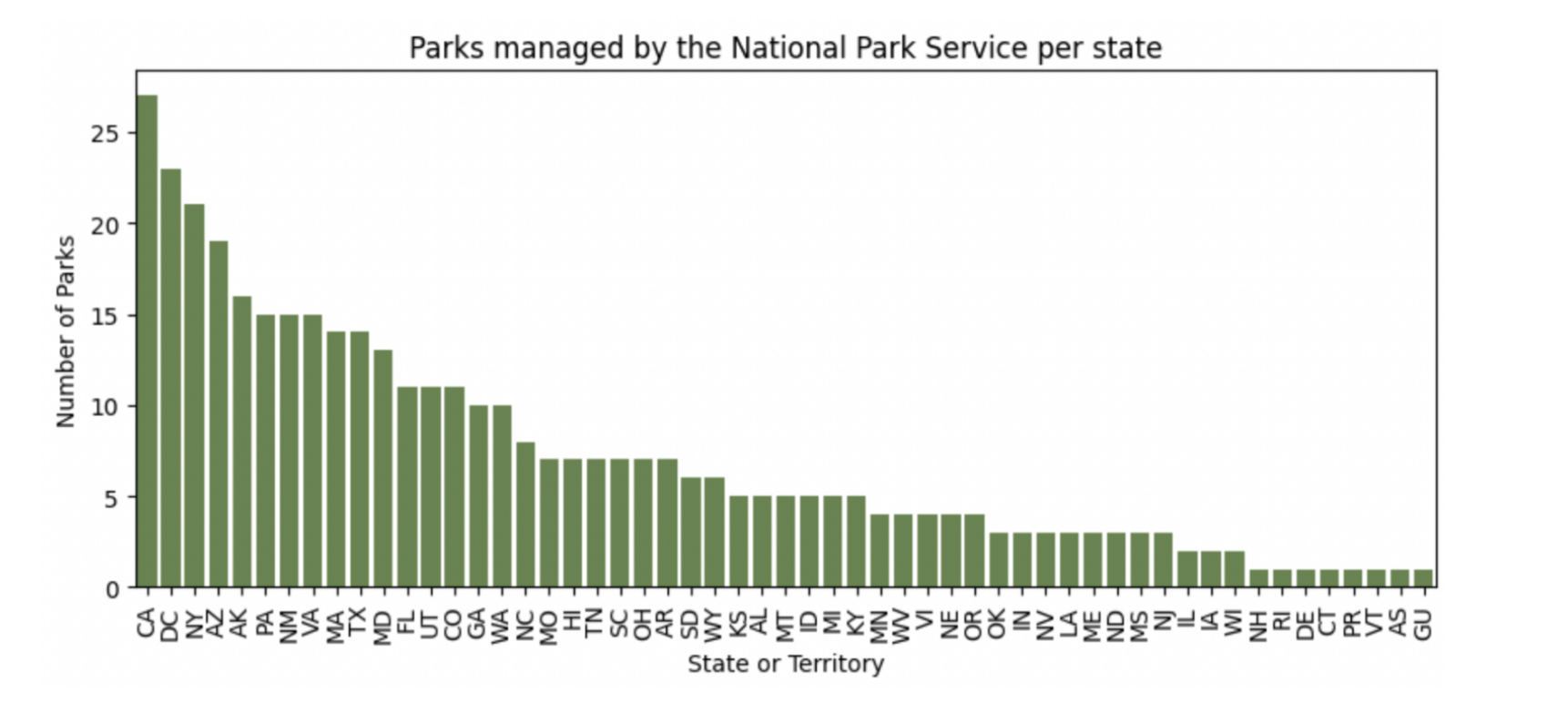
Figure 1: Number of parks managed by the National Parks Service per state.
We also sourced trend data from Google Search Trend data from the past 20 years\cite{google}. Four queries were conducted with the terms ‘pandemic’, ’national park’, ‘best national parks’, and ‘recession’ with columns for the date (monthly) and the frequency of the term.
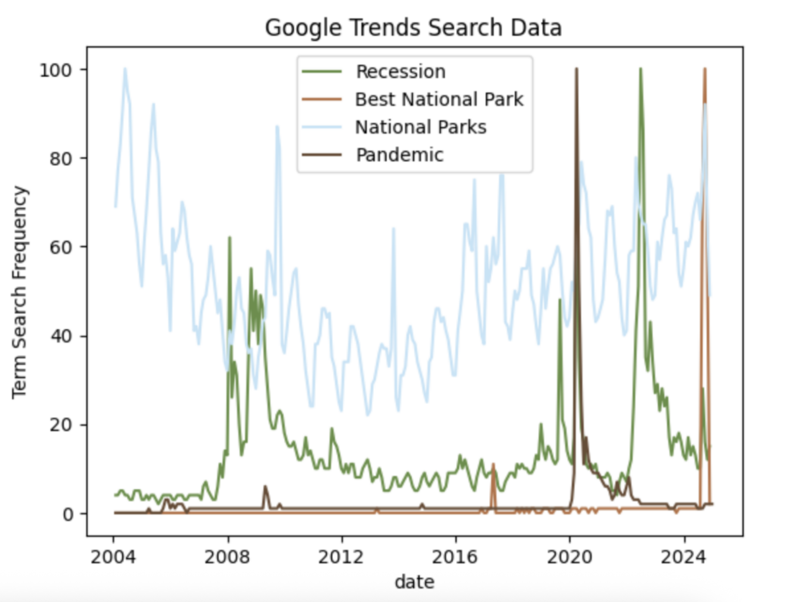
Figure 2: Google search term frequency over time.
Related Work
In “Comparing and Combining Time Series Trajectories Using Dynamic Time Warping” by Neil Vaughan and Bogdan Gabrys, the author apply the Dynamic Time Warping algorithm (DTW) to virtual reality (VR) simulators. They found that DTW was a useful method to understand the comparison of trajectories in VR and for combining trajectories without losing landmarks in the data (compared to combining via a mean average approach). Their findings can be used to demonstrate how DTW is more than just a tool for comparison, but a way to generate a combined time series that minimizes distance between two or more time series. This methodology may be applicable to this research project, as it would provide a way to combine the many different time series of visitation of National Parks per one state better than a simple average or summation.
Results
Do visitation patterns differ by state? Or region?
We began by trying a few different ways to look at the visitation data: raw data, first order differencing, and 12 month differencing. There appear to be strong seasonal components at both the park, state, and regional levels. For example, in figure 3, we can see the visitor rates for Sleeping Bear Dunes National Lakeshore.
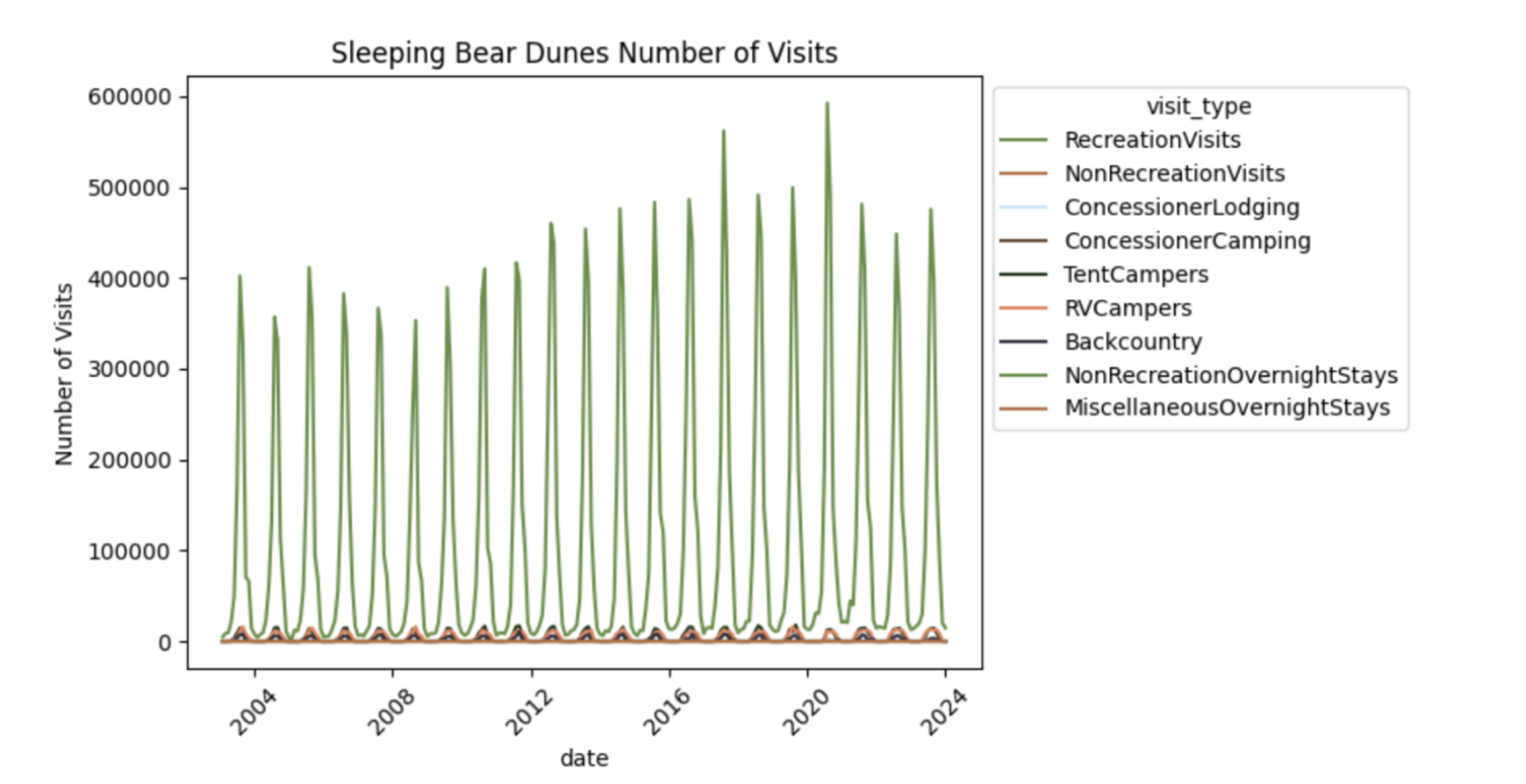
Figure 3: Visitor amounts split by visit type for Sleeping Bear Dunes National Lakeshore.
Additionally, when we aggregate visitor count on the state level, we continue to see these seasonal patterns (refer to the example of Michigan). Going forward, we will use the aggregated data on the state level as some parks (like Gates to the Arctic in Alaska) have very low visitation rates.
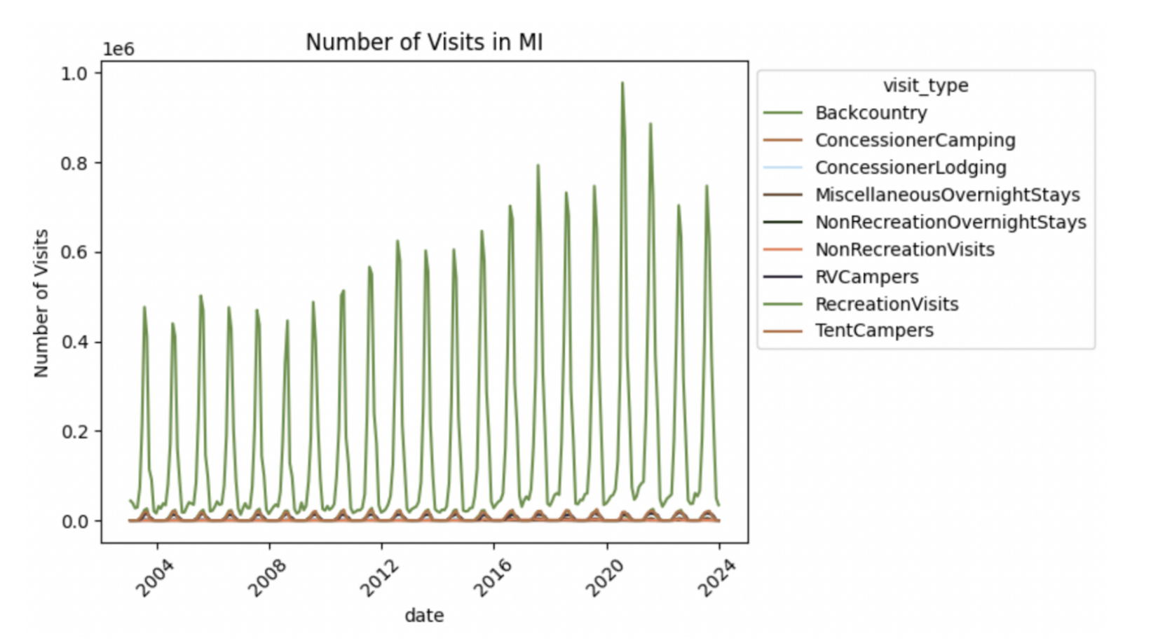
Figure 4: Aggregate visitor amounts split by visit type for National Parks in state of Michigan.
We first attempted to difference the data by looking at the increase in visitors each month. The data was less smooth afterwards this differencing, implying it is not an optimal strategy for analysis. Additionally we differenced with a 12 month period, to see the change in visitors in the same month in the year before. This produced a more stationary time series than differencing with a one month period, but there was still some variance. We then used standardization of data, where for each time series point $(y_k, t_k)$ we transform $y_k$ such that $y_k’ = (y_k -\bar{y})/\sigma$ where $\bar{y}$ is the mean of $y_k \forall k$ and $\sigma$ is the standard deviation of $y_k \forall k$.
This standardization also works well for the comparison of different parks and states, as we want to analyze the changes in visiting patterns over time between different states, and standardizing makes it easier to compare across states with different population/visitor numbers. For example, there are many less visitors in North Dakota than California but perhaps the pandemic changed visitation patterns the same way proportionally for both states.
We aggregated the park visitation on the state level and then standardized, for each type of visitation. Then we standardized the data values in the method described above. For each visitation type, we calculated the cosine, euclidean, and Dynamic Time Warping (DTW) distances.
The five pairs of states with the most similar recreation visits are Wyoming & Colorado, Wyoming & South Dakota, South Dakota & Montana, Wyoming & Montana, and South Dakota & Colorado. These values feel intuitive, as these western states are all near each other.
Next, we extracted the seasonal components of the recreation visits to analyze whether the similarity of seasonal components & trend components matched the similarity of the raw data. For each state’s aggregated raw data, we extracted the seasonal and trend components and then normalized the data. We calculated the euclidean distance, cosine distance, and DTW distance for each pair of states. We found that for seasonal visitation, the top three most similar pairs of states are the same for all three distance types: Washington & Wisconsin, Wyoming & Colorado, and Colorado & North Dakota. Washington & Wisconsin is an interesting pair, as the states are in different regions. They are both in the Northern half of the U.S., though, meaning that perhaps weather or climate could contribute to their seasonality similarity.For the trend component, the top three pairs of states for euclidean and cosine distances are Utah & Colorado, Minnesota & Utah, and Maine & Colorado. The three pairs of states with the most similar trends by DTW cost are Minnesota & Connecticut, Maine & Tennessee, and Minnesota & Utah. Note that Minnesota and Utah are in all three of these lists.
In table 1, we can see that the seasonal similarity is lower on average for pairs of states that are in the same region compared to states in different regions for all different measures of similarity. Hence, states in the same regions’ visitation seasonal trends are often more similar to states in different regions.
Table 1: Similarity of seasonal trends by pairs of states in the same and different regions.
| Euclidean Dist. | Cosine Dist. | DTW Dist. | |
|---|---|---|---|
| Pairs in Same Region | 10.164530 | 0.289913 | 5.882213 |
| Pairs in Different Regions | 11.675012 | 0.360878 | 6.250646 |
Which states are most similar in terms of their national park type distribution?
For each state, we calculated the number of each type of park (National Historic Park, National Park, National Monument, etc.) in that state. For each pairs of states, we calculated the euclidean distance, Jaccard similarity, cosine distance, and DTW cost for the vectors. The DTW cost is not pertinent in this case, as there is no time component. We selected the euclidean distance to create the graph using networkx, by keeping only the pairs of states that are in the 25% most similar of the euclidean distance, meaning the smallest 25% of euclidean distances.
The states are the nodes in the graph and the edges connect states with euclidean distances less than 2.645751 (which is the 25th percentile of all euclidean distances). The graph created has 40 nodes and 336 edges, creating two connected components as shown in figure 5 below. The largest connected component has 38 nodes and 335 edges and the smaller component has 2 nodes and 1 edge. The smaller connected component is made up of Utah and Colorado, which are both states in the Intermountain region.
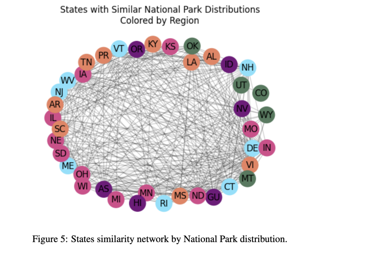
Figure 5: States similarity network by National Park distribution.
The states with the highest degrees are the Virgin Islands, Illinois, and Indiana. The states with the highest pagerank values are the Virgin Islands, Illinois, and Montana while the states with the highest clustering levels are Arkansas, Michigan, and Rhode Island.
The states with the lowest degrees are Tennessee, Utah, and Colorado. Tennessee, Arkansas, and Hawaii have the lowest page rank values. The states with the smallest clustering values are Colorado, Utah, Tennessee, and Hawaii. It stands out that Tennessee is in all three of these lists. It appears that this state is an outlier, as it has a low number of states that it is similar to.
We grouped the nodes by their region and calculated the average pagerank, degree, and clustering. The Southeast the lowest page rank scores, meaning these states are the least influential. The Pacific West & Northeast have the highest page rank scores meaning their states are the most influential (and most similar). They also have the highest degree. Alaska and the National Capitol are not even included in the graph, meaning they contain the least similar states to all states. This makes sense, given that Alaska is geographically isolated and the National Capitol (containing only Washington D.C) has a unique amount of National Monuments and Military parks. The Northeast has the highest clustering value, meaning that the highest ratio of closed triangles that run through the Northeast states. This means that most of the states in the Northeast’s neighbors are also connected to those state’s other neighbors. Refer to table 2 for the full information.
Table 2: Summary of similarity network information.
| Region | Pagerank | Degree | Clustering |
|---|---|---|---|
| Intermountain | 0.025626 | 11.200000 | 0.490830 |
| Midwest | 0.023852 | 16.416667 | 0.739979 |
| Northeast | 0.030223 | 22.625000 | 0.793526 |
| Pacific West | 0.027283 | 19.833333 | 0.710120 |
| Southeast | 0.020019 | 13.222222 | 0.683691 |
Did the 2008 recession & 2020 Covid-19 Pandemic have impacts on National Park visitation?
In order to analyze how these events impacted national park visitation data, we will focus only on Recreational Visits. This is because almost every park has frequent recreation visits, but not all parks have non-recreation visits or camping visits. For example, national historic parks like the Eleanor Roosevelt National Historic Site are day use only (as per the National Parks Official Website). We will build a series of ARIMA models for each state, using the pmdarima.autoarima module.
The pmdarima.arima.auto_arima model that grid searches different p, q, and d values to find the optimal values. We aggregated on the state level again, as per the same reason as states above. This deals with sparsity, as some national parks have very few visitors.
We split the recreation visitor data before and after the event. For the 2008 recession, we split the data before and after December 1st, 2007 and for the 2020 pandemic, we split the data before and after March 1st, 2020. The data before the event was used to train the ARIMA model and the data after the event was used. The data for each state after the event was used to test the model. This method was devised in order to see if the pandemic and recession caused a change in typical visitation patterns. If the model predictions after the event are very similar to the true values, we might assume that the event did not have a significant impact on the park visitation in that state. If the model predictions are very dissimilar to the true values, then we might assume the event did have a significant impact on the park visitation in that state. This is not statistical proof of causation, but a similar process to a Granger Causality Test. We will conduct a t-test between the actual visitation records and the prediction to see if there is a ‘significant’ difference. The significance level of alpha = 0.05 will be used.
In total we made 110 models, 2 per each state (or state-like entity e.g. Puerto Rico, DC, Guam, etc.) included in the dataset. The models were evaluated by using root mean squared error divided by standard deviation of the data. (this method is used as a way to standardize the errors across states with vastly different recreational visit counts) and the p-value of a t-test comparing the predicted and true values. For the Covid-19 event, we found that these five states had the largest p-values: Tennessee, Maine, Michigan, New Mexico, and North Dakota. The states with the smallest standard errors were Michigan, South Dakota, North Dakota, Maine, and Wyoming. Michigan Maine, and North Dakota’s models performed best by both metrics used. Hence, we will say (in a limited statistical capacity) that these three state’s National Parks were least impacted by the global pandemic. The states with the lowest p-values and highest standardized errors after the pandemic were Louisiana (refer to figure 6), American Samoa, Rhode Island, Illinois, and South Carolina. Therefore we find it likely to say that these five states were most heavily impacted by the pandemic, as the model trained on the data before the Covid-19 pandemic fit the least well.
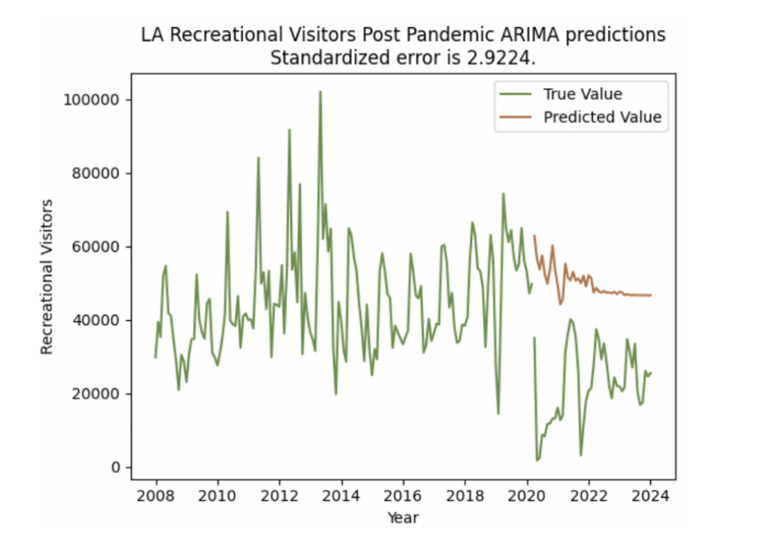
Figure 6: Louisiana recreation visitor predictions post-pandemic, with significant difference from true values.
Overall, we found that 28 states had statistically significant p-values from their t-tests and 27 did not. We think it is likely that about half of the states’ National Parks’ visitation rates were heavily impacted by the events of the Covid-2019 pandemic.
For the model trained on pre-2008 recession data and evaluated on post-2008 recession (but before March 2020) data, there are 3 states in that are in the list of top five highest p-value values and top ten lowest standardized root mean squared error values: Massachusetts, Pennsylvania (refer to figure 7), and West Virginia. Hence, we will say in our limited statistical capacity that these states’ national parks’ were least impacted by the 2008 recession. American Samoa, Guam, Illinois, Kentucky, and the Virgin Islands were in the list of top five lowest p-value scores and top five highest standardized root mean square errors; thus we find it likely that they were most impacted by the 2008 recession. One possible explanation for this is that American Samoa, Guam, and the Virgin Islands are all islands and territories, meaning that they are more expensive for travelers from the mainland United States. For the 2008 recession, we found that 33 out of the states models’ predictions had p-values below 0.05 meaning that they are statistically significant. We find it likely (again, in our statistically limited sense) that these states’ national parks’ visitation numbers were impacted by the 2008 recession.
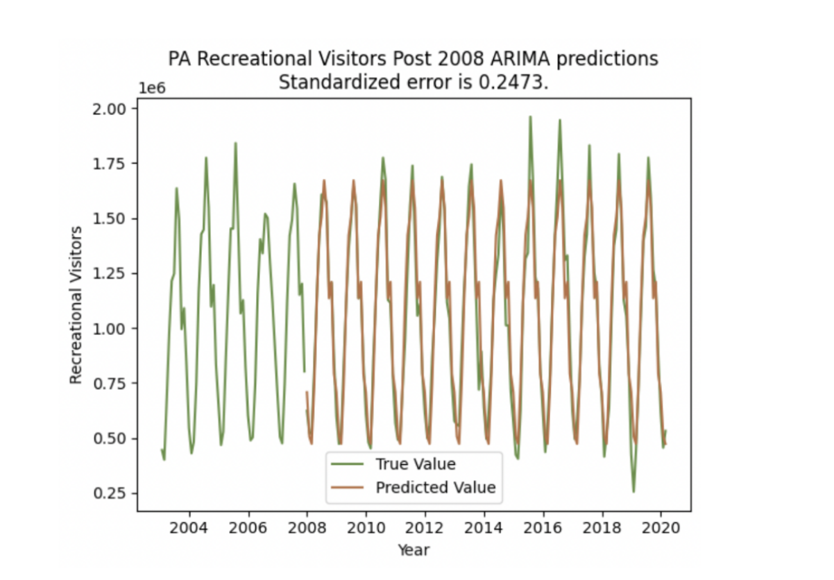
Figure 7: Pennsylvania recreation visitor predictions after the 2008 pandemic. Note that there is no statistically significant difference between the prediction and the true values.
Does Google Search Data for terms related to ‘recession’, ‘best national park’, ‘covid-19’ and ’national park’ impact our prediction abilities for national park recreational visitors?
After our findings from the previous question, we wanted to continue to examine the impact of these events. We used Google Trends data to approximate public perception of these events. We used four queries: ’national parks’, ‘best national parks’, ‘pandemic’, and ‘recession’ and conducted Granger Causality tests on State level national park visitation data and the Google search data. Before running the Granger Causality tests, we had to ensure that the input data was stationary. To do so, we wrote a function that applies 3 methods to stationarize the data and validates that it is stationary via Augmented Dickey-Fuller unit root test.
The function tries differencing and then calculating weighted moving averages with different window sizes in order to make the data stationary. Once both the search data and visitation data for each state has been standardized, we used the statsmodels.tsa.stattools.grangercausalitytests.
We want to note that Granger Causality is a controversial method that does not prove statistical causality, but it is a useful tool in the industry for identifying trends\footnote{As we say at Meta, “Move fast!”. It is often more important as an industry data scientist to identify broad trends and actionable insights rather than rigorously proving causation.}. We once again used a significance level of alpha = 0.05 for our tests.
We found that for 26 states, their national parks recreational visitors predictions would by improved by using the search data for ‘recession’ and for 44 states, their predictions would be improved by using the search data for ‘pandemic’.
Nine states’ predictions were improved by the search data for ‘best national parks’ and fourteen states by the search data for ’national parks’. There are four states that were improved by both of the national parks query data: Montana, Nebraska, American Samoa, and Alabama.
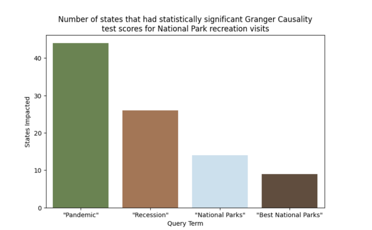
Figure 8: The number of states with statistically significant results of Granger Causality test (with a significance level of alpha = 0.05) that were impacted by each query term.
Discussion & Conclusions
This study has allowed us to learn about visitation patterns in the National Parks.
We found that seasonal visitation patterns do differ by state. The top pair of states by DTW of seasonal time component are Washington & Wisconsin, which are not in the same region as defined by the National Park Service. WA and WI are both in the Northern half of the United States. States nearby to eachother geographically are also quite similar, even if they are not in the same region. For example, Colorado and North Dakota had the third most similar seasonal trends. They are listed as different regions (Intermountain and Midwest), though they are closer geographically than North Dakota and Ohio, which are both in the Midwest region. This suggests that broader regions may be helpful tools for analysis of the National Parks. Perhaps analyzing the parks by biome or weather patterns would be useful for understanding generalized patterns across the parks.
From our network analysis we found that the Alaska and National Capitol regions were not included in the similarity network as they were so unique. These two regions also happen to be the only regions composed of one state (or district). It is possible that these region identifiers are not very meaningful, as they refer to one state each and are so dissimilar to the other states.
From our research, it appears that the 2020 pandemic and the 2008 recession both impacted National Parks visitation. It is important to note that the methodologies used are both not statistical proof of causation, but they can offer us intuition on how global events may have impacted visitation in National Parks across the United States. Our ARIMA analysis indicates that 28 of the states/territories’ National Parks’ recreational visitation rates were significantly impacted by the pandemic and 33 by the 2008 recession.
Similarly, from our Granger Causality analysis, we saw that search information for ‘recession’ improved modeling for 26 states and search information for ‘pandemic’ improved modeling for 44 states. This might indicate that public perception of global events strongly impacts how people travel to the U.S. National Parks.
Additionally, we ran Granger Causality tests on search queries for ‘National Parks’ and ‘Best National Parks’ with the state by state National Parks visitor data. This was based on an anecdotal hypothesis that the National Park Service’s social media presence is influencing visitation. It appears that for 14 and 9 states respectively, the query data ‘granger caused’ the visitation. Again, it is important to note that Granger Causality does not measure the direct impact of one event on the other: there could be other confounding variables that are influencing these results. This information can help the National Park Service plan for how other global events might impact the visitation amounts, so that they can better plan the permit distribution and their seasonal worker staffing plans.
Areas for Further Study
There is much room for additional study of these topics. To further understand how the pandemic & 2008 recession impacted National Parks visitation, we could examine cost of travel, covid exposure numbers, and the different travel laws by state in the US. For example, New York had California had mandatory quarantine periods but Michigan did not. This could be a reason to explain why Michigan appears not to be significantly impacted by the Covid-19 pandemic while CA & NY were.
Additionally, it would also be interesting to have more geographic information about the parks to measure similarity: Does the park contain mountains? Waterfalls? What is the elevation? Additionally, it would be interesting to see what kind of wildlife is native to each park. For example, Isle Royale National Park in the Upper Peninsula is a destination for many Michiganders who want to see moose, as they are extinct in the lower peninsula.
We are also interested in studying the National Park Service’s social media and how that may have influenced visitors. The Google search queries for ’national parks’ and ‘best national parks’ could be a proxy, but it would be interesting to look at Instagram engagement metrics, advertisements, and recommended Facebook post data to see how that relates to visitation.
There are many more interesting tidbits and trends to be mined, with more data and more time.
Acknowledgements
Thank you to the cast & crew of acclaimed television show \textit{NCIS}, as I watched about 2 seasons while working on this final project.
References
Google. 2024. Google Trends.
Aric Hagberg, Pieter Swart, and Daniel S. Chult. 2008.
Exploring network structure, dynamics, and function using NetworkX.
Technical report, Los Alamos National Laboratory (LANL), Los Alamos, NM, United States.Skipper Seabold and Josef Perktold. 2010.
Statsmodels: Econometric and statistical modeling with Python.
In Proceedings of the 9th Python in Science Conference.United States National Park Service. 2024a.
NPS Visitor Use Statistics Definitions.United States National Park Service. 2024b.
National Park Service Visitor Use Statistics. Data available at: irma.nps.gov/Stats/Taylor G. Smith et al. 2017–.
pmdarima: ARIMA estimators for Python. [Online; accessed 12/08/2024].Neil Vaughan and Bogdan Gabrys. 2016.
Comparing and combining time series trajectories using dynamic time warping. Procedia Computer Science, 96:465–474.
Knowledge-Based and Intelligent Information Engineering Systems: Proceedings of the 20th International Conference KES-2016.
Note: When I wrote this assignment in 2024, I did not use AI! As an Graduate Student Instructor myself at the time, I was not interested in using AI in my own assignments! But, for (finally) putting this on my personal site, I did use AI to take my LaTeX tables into Markdown.